PRESS RELEASE:
DRAGON CON REVEALS NEW SLEEK, ICONIC LOGO
New Modern Logo Honors Past and Represents the Future of Dragon Con
Dragon Con, Atlanta’s internationally known pop culture, fantasy and sci-fi convention, has a new logo, the first update in almost 20 years.
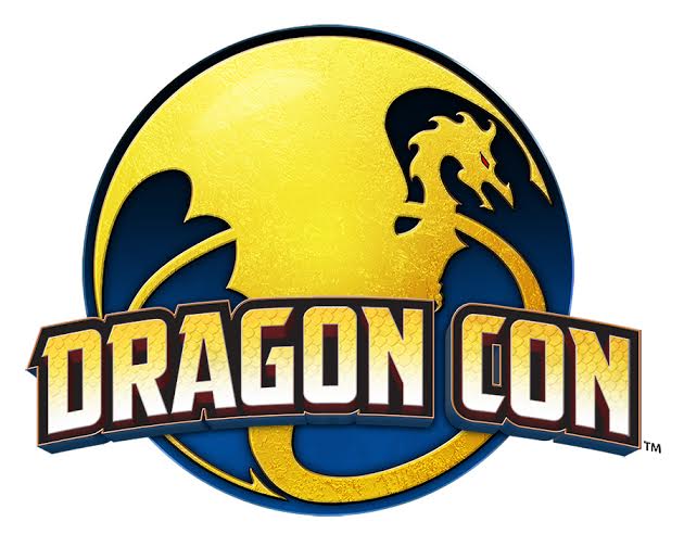
The new Dragon Con logo features a dragon in profile contained within a circle, with the Dragon Con name arching across the middle. The new colors are blue and gold with a touch of red, giving the design a bold and contemporary look.
“It was time to freshen up our logo, but it was important to maintain some continuity with the past,” said President Pat Henry. “The new logo honors our past, but also gives us something that represents Dragon Con’s present and future.”
The new logo design translates the former logo into a flatter graphic image which should become iconic and stand the test of time. The design is also easily translated into black and white from its rich color palette. The sleek new logo has modern appeal, but still reflects the convention’s humble beginnings.
“We are not the same show that we were back in 1995. We have experienced tremendous growth, morphing from a small convention that catered to a few specific interests into one embraced by the mainstream culture that encompasses so many aspects of fandom,” Henry said. “As we continue to grow and evolve, we believe our logo should reflect that.”
The modernized logo comes on the heels of the decision to update the convention name from Dragon*Con to Dragon Con, as the convention renews its style to reflect that of its membership and offering the best of pop culture, fantasy and sci-fi to its members in the 21st century.
About Dragon Con
Dragon Con is the internationally known pop culture convention held each Labor Day in Atlanta. Organized for fans, Dragon Con features more than about 3,000 hours of comics, film, television, costuming, art, music and gaming over four days. For more information, please visit www.dragoncon.org and follow us on Facebook and Twitter.
